
Outdoors For All
Rebranding Project
“To enrich the quality of life for children and adults with disabilities through outdoor recreation.” Outdoors For All Foundation


CONTEXT
Overview
The Challenge
HCDE 308 Visual Communication's final project was to conduct a design re-brand for a local non-profit. I chose Outdoors for All, an organization offering adaptive and therapeutic recreation for children and adults with disabilities. They combine inclusivity with adventure to promote independence, socialization, and of course – fun! Their brand welcomes all individuals to embark in outdoor recreation through a variety of outdoor programs.
Role
Duration
Softwear
Deliverables
6 Weeks Spring 2023
Figma
User personas, logo, wireframing mobile and desktop prototype
Solo Designer
Design Question
How can I incorporate Outdoors For All's company values and current branding into a vibrant and adventurous redesigned visual identity?
Understand the current brand identity and target audience
Create a new brand identity that embodies Outdoors For All's history, values, and strategic objectives
Apply consistent visual language across all digital interfaces, creating a more intuitive and enjoyable user experience


CURRENT BRAND IDENTITY
“To enrich the quality of life for children and adults with disabilities through outdoor recreation.”
Mission Statement
Founded in the Pacific Northwest, and even more specifically at the Summit of Snoqualmie, Outdoors For All provides a diverse variety of outdoor recreational instruction.
Their values are centered around providing accessible and inclusive adventure to transform the lives of individuals, families and communities identifying with disabilities.
The organization is community driven, Outdoors For All on average provides outdoor industry training to more than 850 volunteers on a annually.
Who We Are. (2024). Outdoors For All Foundation, https://outdoorsforall.org/about-us/who-we-are/
Company Ideals
THE PRODUCT: REDESIGNED DESKTOP UX


REBRANDING
frog green
Hex: 7A991B
RGB: 122-153-27
CMYK: 12-0-49-40
bark brown
Hex: 995A3F
RGB: 153-90-63
CMYK: 0-25-35-40
soft lime
Hex: AFDF89
RGB: 175-223-137
CMYK: 19-0-34-13
evergreen
Hex: 4B7A44
RGB: 75-122-68
CMYK: 18-0-21-52
Inspired by the Pacific Northwest, the color palette draws from the natural tones of Washington’s forests. Green serves as the primary color, complemented by lighter and darker tints, while bark brown adds contrast to complete the evergreen forest theme.
Color Pallet
Type Hierarchy
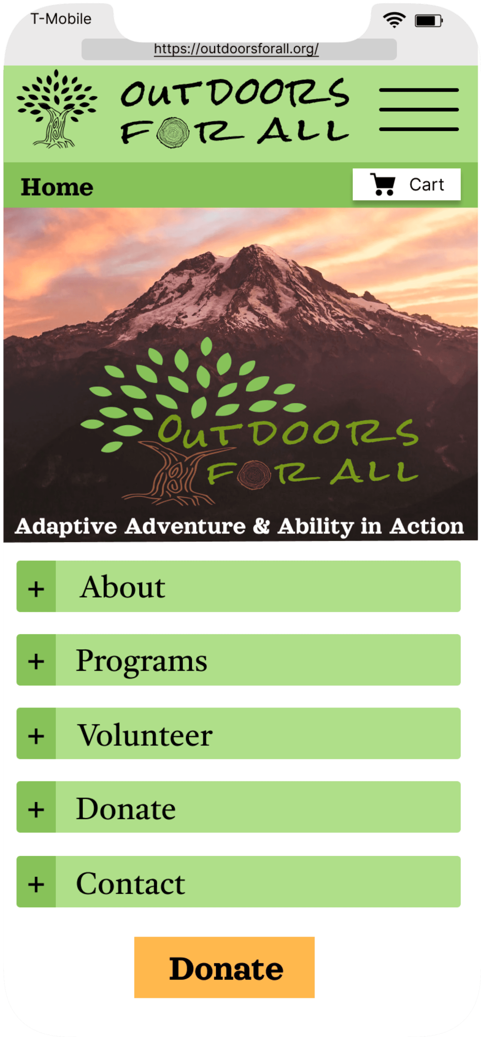
Logo


outdoors for all
Icon Only
Without Icon
Original Logo
Text Only
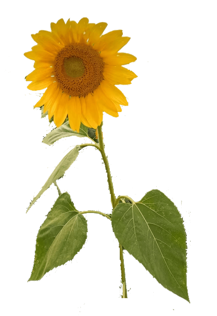
The re-designed logo embodies Outdoors For All’s nature-driven, adventurous and charitable characteristics through a rustic typeface and symbolic tree. The font Rock Salt conveys a rugged and lively feel. The tree that surrounds the text symbolizes charity and compassion.
Color Pallet
Type Hierarchy
Logo
1
2
3

Header 1
Orelega One Regular
60 px
Header 2
Castoro Regular
35 px
Subheader 2
Poppins Medium
20 px
Paragraph
Poppins Regular
16px

MOBILE
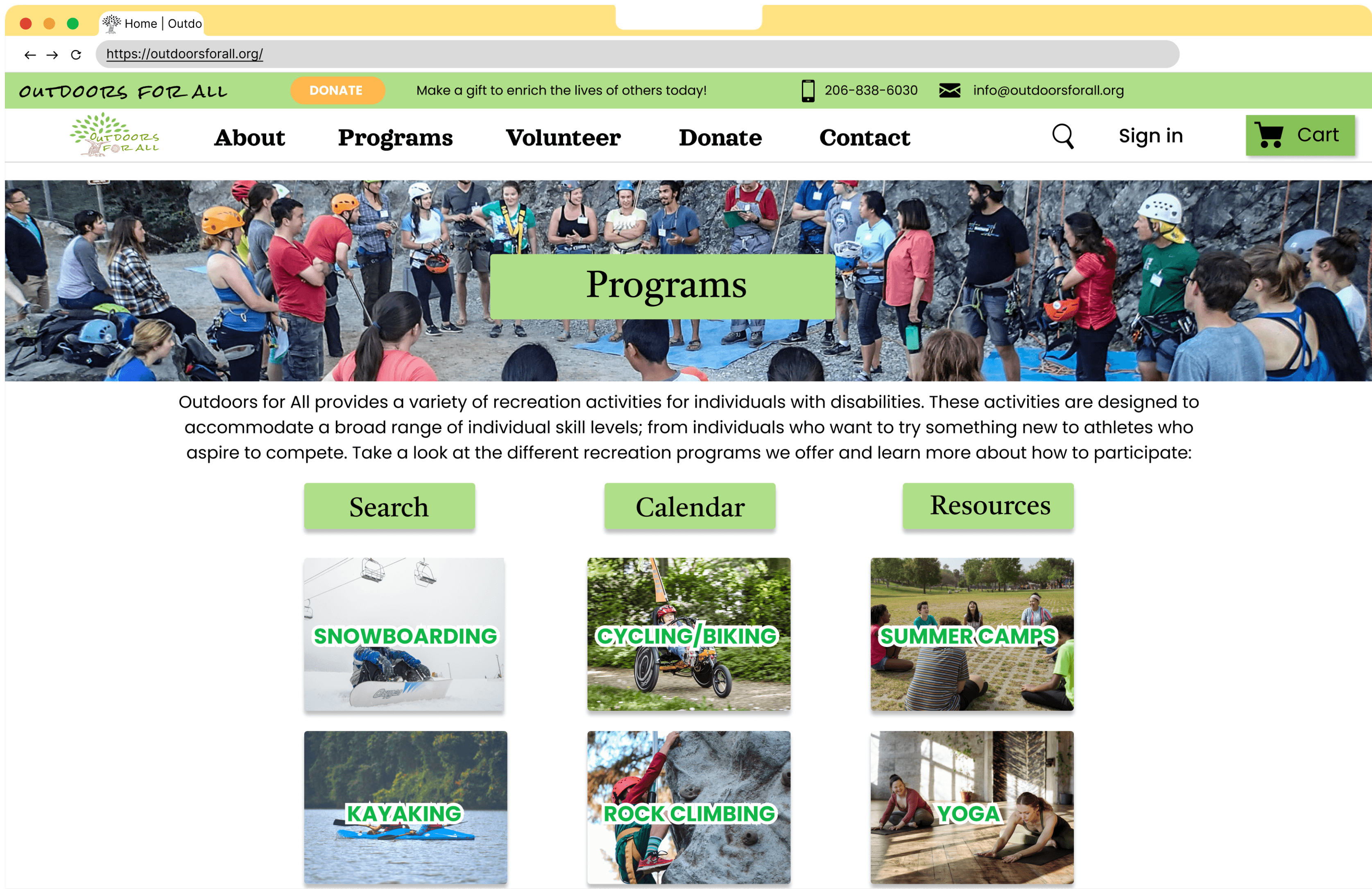
CURRENT

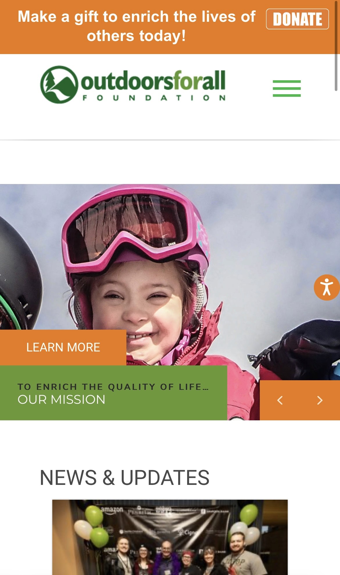
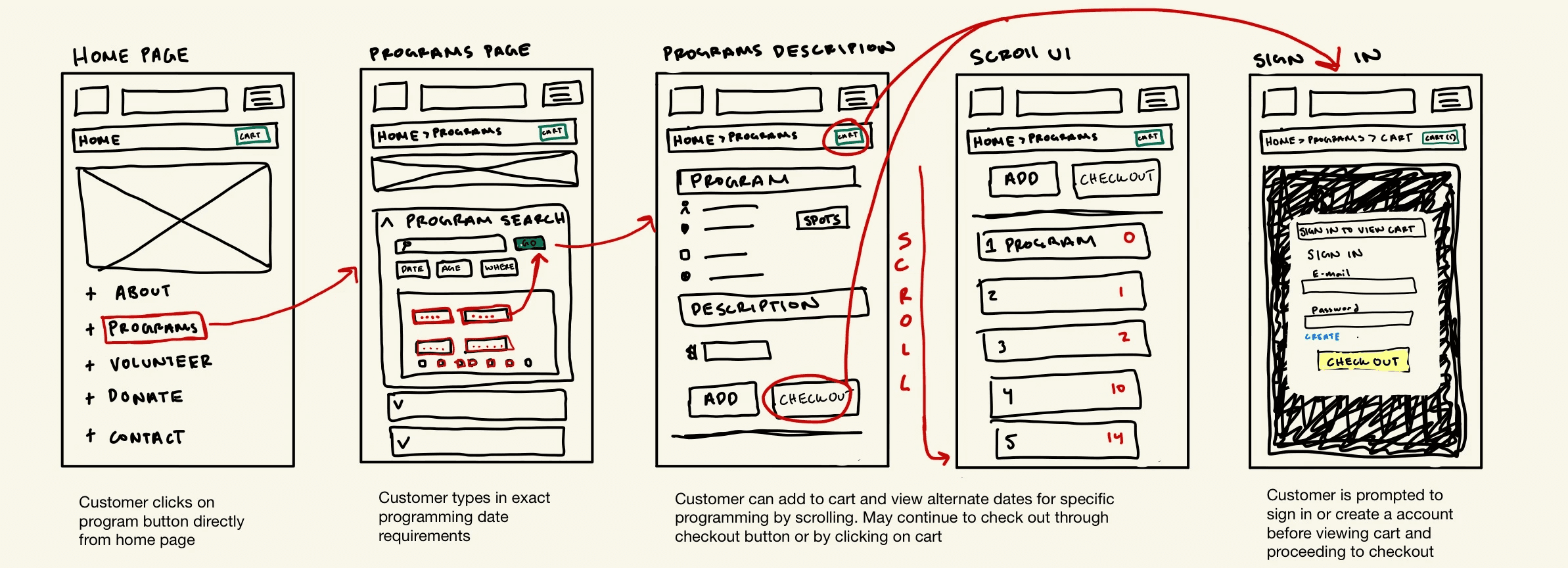
User is greeted with a continuous picture album and excess white space surrounding informational elements
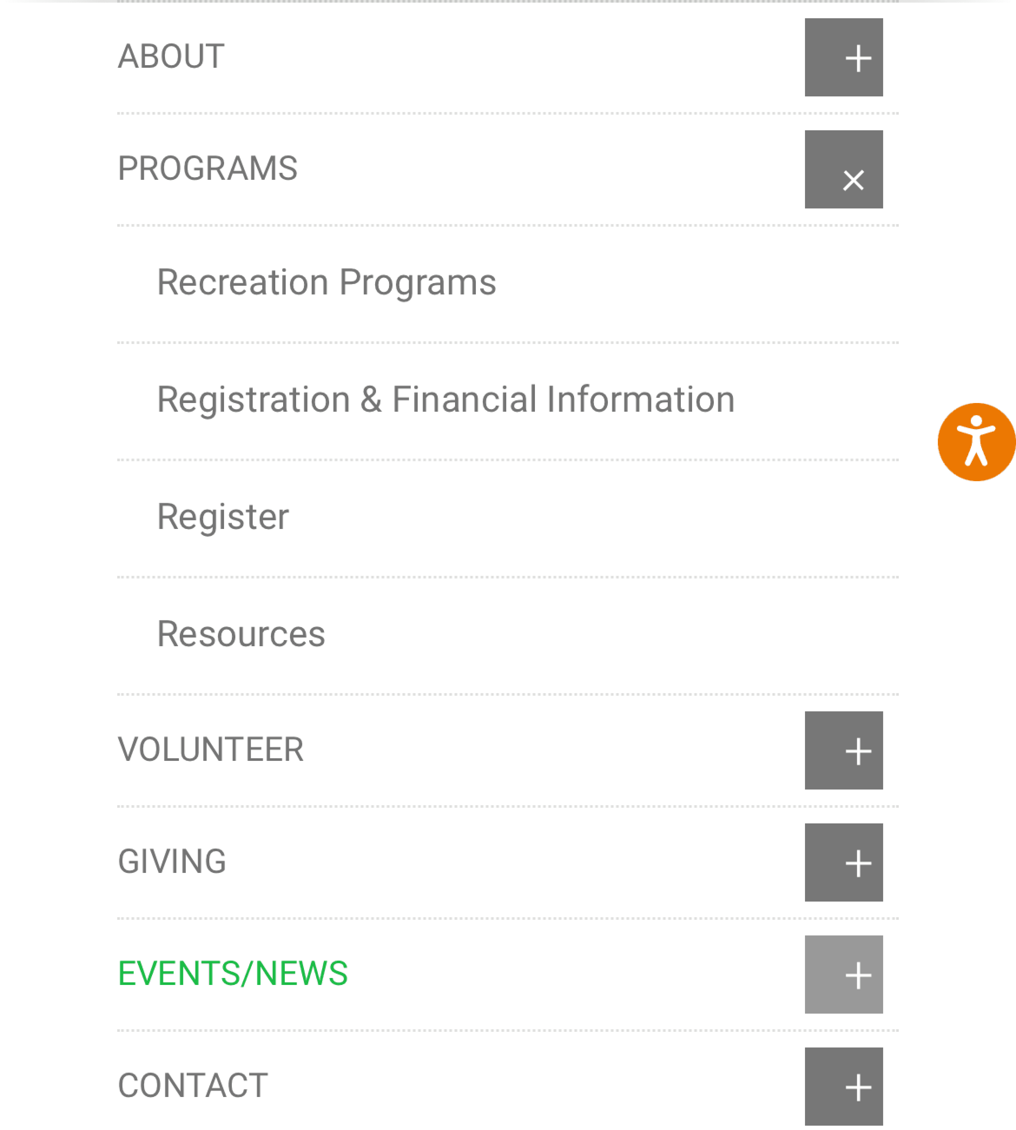
User must use a "hamburger menu": navigational drop-down task bar in the top right
"Programs" and "Recreational Programs" are different pages
User scrolls down and is faced with more drop down icons for every offered program with descriptions.
Redirected to a new tab to view current programs
Clicking a specific activity prompts user to sign in before displaying program detail information

Focused Task: Navigate to programs page and search for currently offered recreational programs to add to user's cart

User must click on a small print "HERE" hyper link to view up-to-date program offering

START
END

Lack of diverse visual elements
Unproportional taskbar type hierarchy
Confusing navigation for program search
Too much content per dropdown
Redirection to different tab when searching availability
Self-observed Pain Points


DESIGN PROCESS
User Persona
Taskflow
Wireframing
UI Style Tile
DEFINE & IDEATE

User Persona
1
Sketched Taskflow
2


Wireframe
3
*Not based on a real user: Fictional character I created to illustrate the need for a redesigned program search UX

UI Style Tile
The primary button is the branded color when active and changes to a lighter tint when in hover state
Secondary buttons play with shape to indicate hover states
Text boxes are outlined in blue to contrast the non-profits general green color
Default
Focus
Hover
Active
Static
Filled
Error
Primary
Secondary
Text
placeholder
placeholder
placeholder
placeholder
placeholder
placeholder
placeholder
placeholder
placeholder
placeholder
Invalid email address
!
placeholder
placeholder
4


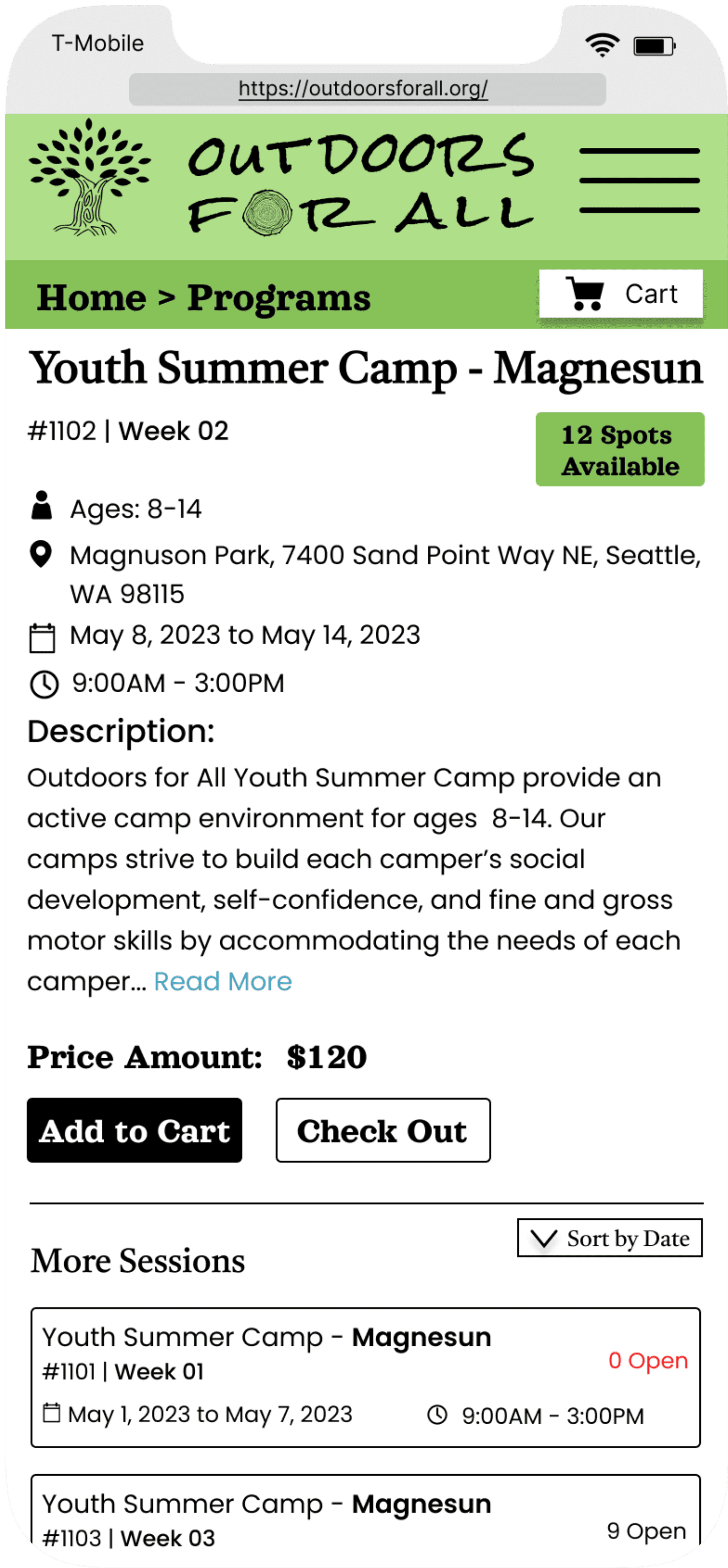

MOBILE HIGH FIDELITY PROTOTYPE
*Currently Touching up UI on Figma. Check back to interact with mobile interface!
DESKTOP HIGH FIDELITY PROTOTYPE
Reflection
This project was my first introduction to hands-on visual communication, UX/UI design and using the design program Figma. Due to class time constraints and deadlines, I would like to spend more time redesigning the mobile interface for a more refined visual presentation. I am currently in the process of expanding the user flow of my mobile interface, cleaning up visual elements, and incorporating accessibility features such as alt-text to images.
For future projects I would consider:
Incorporating real user research through surveying and interview studies
Collecting and integrating user feedback through usability testing on my prototyped interfaces
Implementing additional user flows and prototyping more features such as the donate button